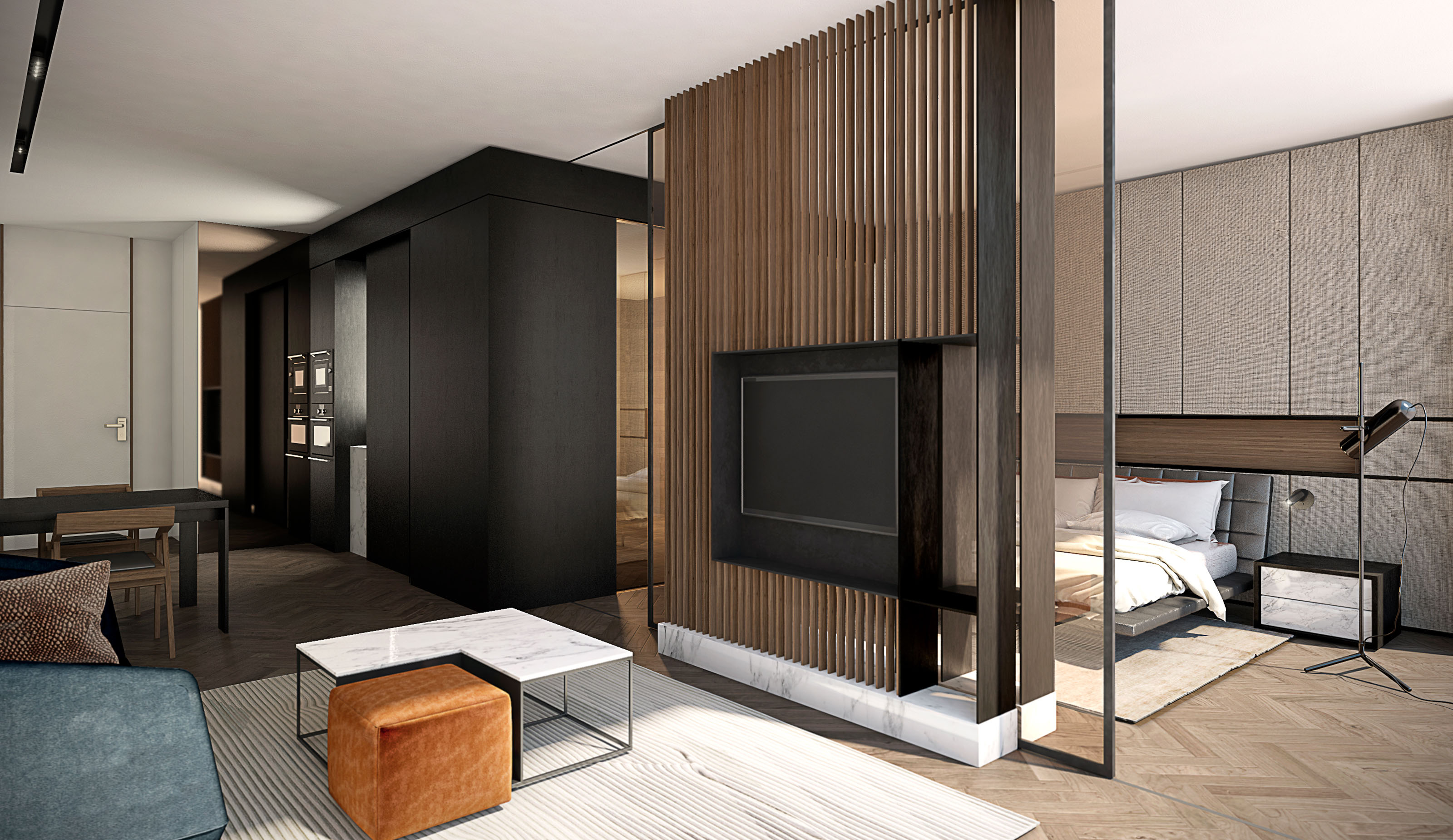
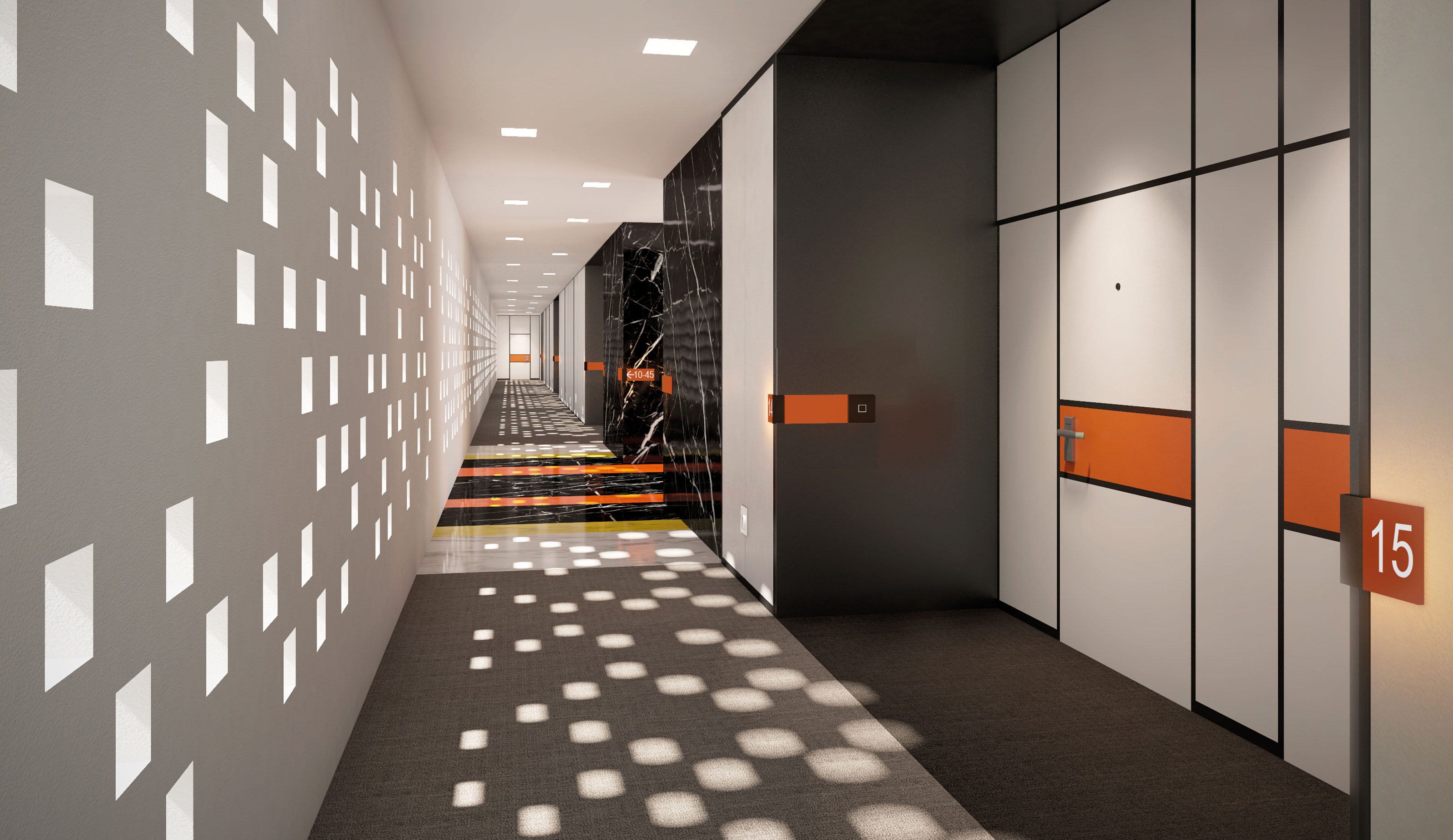
The elements of the facade, inspired by Mondrian’s art, are reinterpreted in the interior design and are the main theme followed throughout the interior design. An edginess in the space is achieved by the use of square and rectangular frames of different sizes and vibrant primary colors which recall the Dutch artist’s palette. This is a recurrent theme in all common spaces, all of which have a Modernist, timeless feel expressed with maximum elegance.
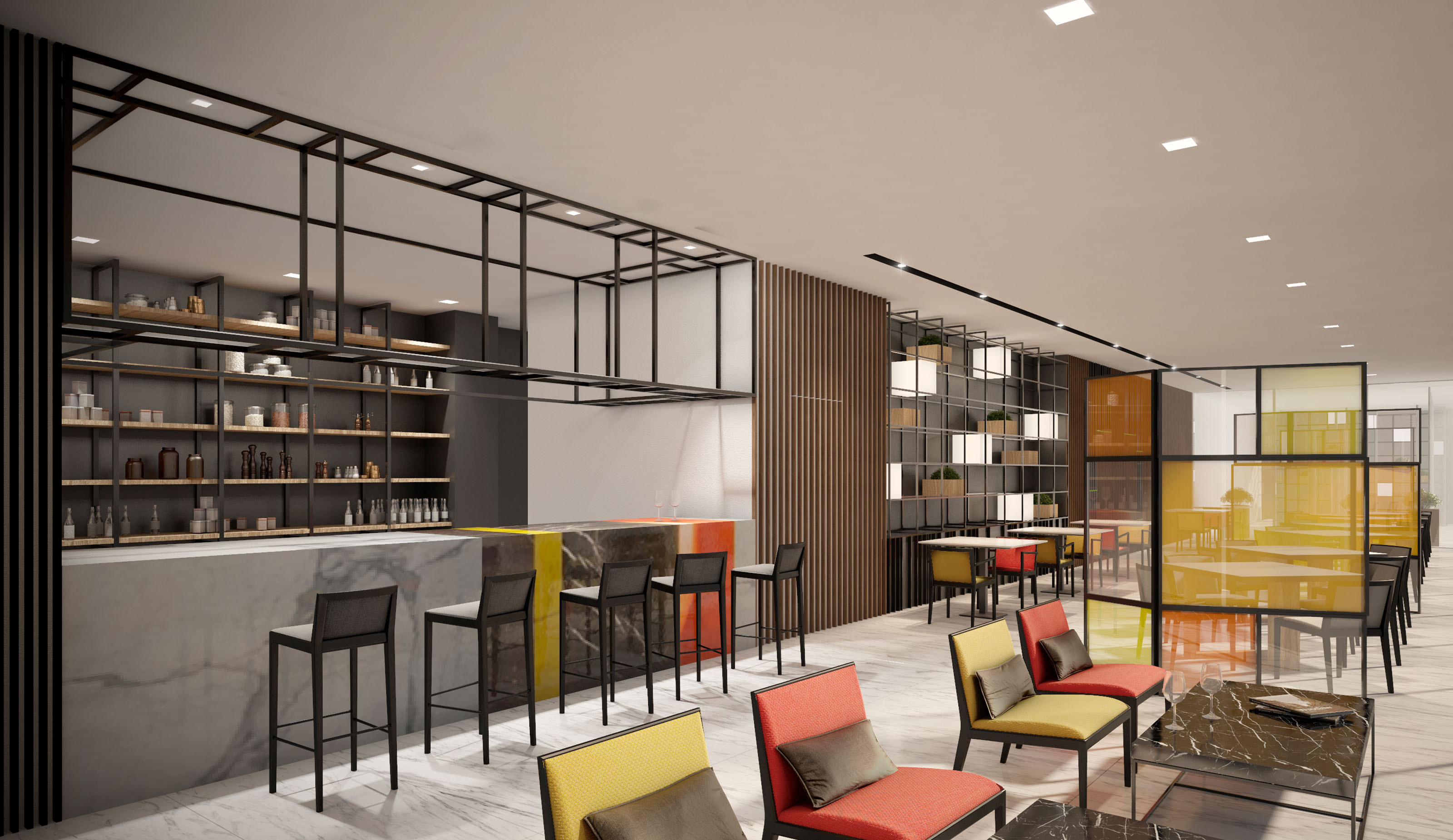
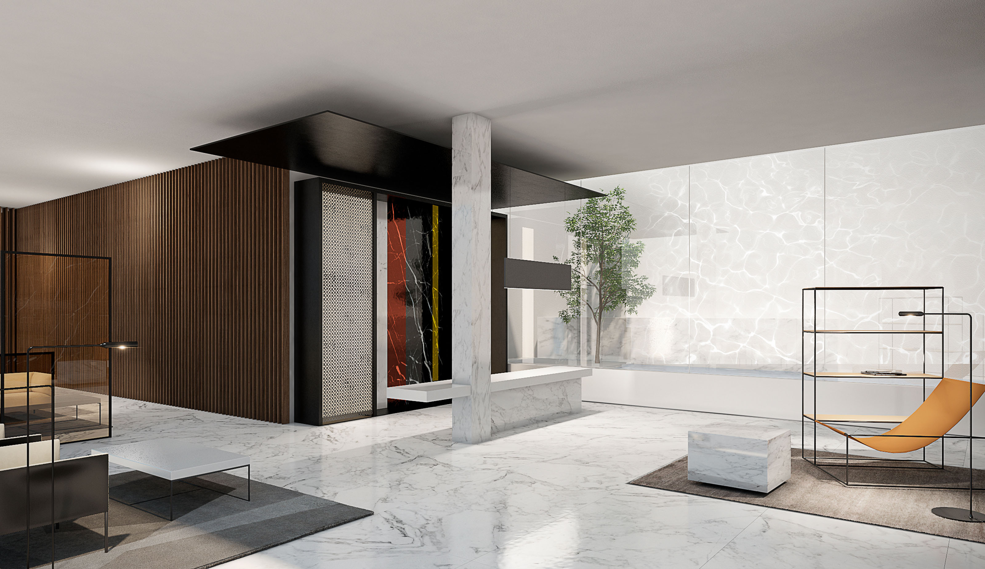
A playful use of volumes, especially in the reception area, is achieved with stone columns and the vertical and horizontal lines of the furniture and decorative elements, which awake curiosity in residents and visitors. The bar reveals a bolder approach, with lines becoming the main element accompanied by the yellow and orange chairs which break with the black and white texture of the stone bar and floors and darker shelves in the walls.
